OutdoorPersonals
An activity-partner matching platform built around a weighted compatibility model, with safety features, region gating and shared outing plans. Built as a complete MVP, not deployed.
- Project
- OutdoorPersonals
- Role
- Designer & Developer
- Timeline
- 2026
Matching people who want the same day out
Finding people to do outdoor activities with is a real problem, and dating apps are built for a different question. What matters here is whether you hike at the same pace, have comparable experience, want the same kind of day, and are free at the same times.
Someone who wants to summit fast and someone who wants to photograph wildflowers should be matched with people who want what they want.
An opinionated matching model
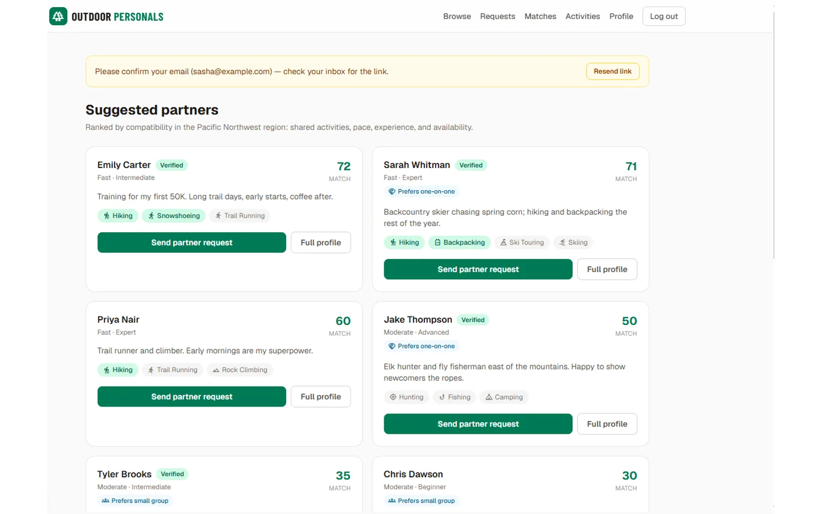
Compatibility scores 0–100 from weighted components: shared activities at 40%, pace at 20%, experience level at 15%, availability at 15%, and outing style at 10%.
The weighting is an argument. Shared activity interest dominates, because it’s the thing you’d be doing together. Pace and experience sit meaningfully above scheduling, because a mismatch there makes for a genuinely poor and occasionally unsafe outing, while a scheduling mismatch just means waiting for a better weekend.
The model is deterministic and inspectable rather than learned, which suits a product with no interaction data yet — and it means a user can be shown why a match was suggested. The score appears on every partner card and the browse screen names the factors behind it; a per-match breakdown showing how the number was reached is the next piece to build. After an outing, both people rate it, and that feedback feeds later matches.
Safety designed in
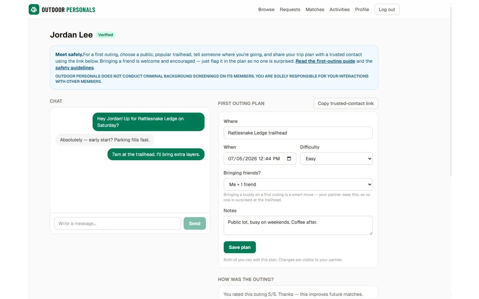
Meeting strangers in remote places carries risk a normal social product doesn’t, so it’s part of the data model: reporting and moderation, an admin review surface, and shared outing plans — accessible by token, so trip details can be sent to someone who isn’t on the platform. That’s the digital version of telling somebody where you’re going.
Regions carry an open or waitlist state, so the product can launch where there’s enough density for matches to actually happen.
Scope
22 pages covering signup, onboarding, profiles, browsing, matches, requests, messaging, activity and guide content, safety information and admin. A data model across users, profiles, matches, requests, messages, outing plans, reports, regions and email tokens. A 37-entry catalog holding 29 activities alongside resource groups, services and safety topics, with authentication including email verification and password reset.
Where it stands
A complete, working MVP running locally. The substance is the product thinking: deciding what to match on, weighting it defensibly, designing for safety, and solving cold-start density before launch rather than after.
Inside the project
2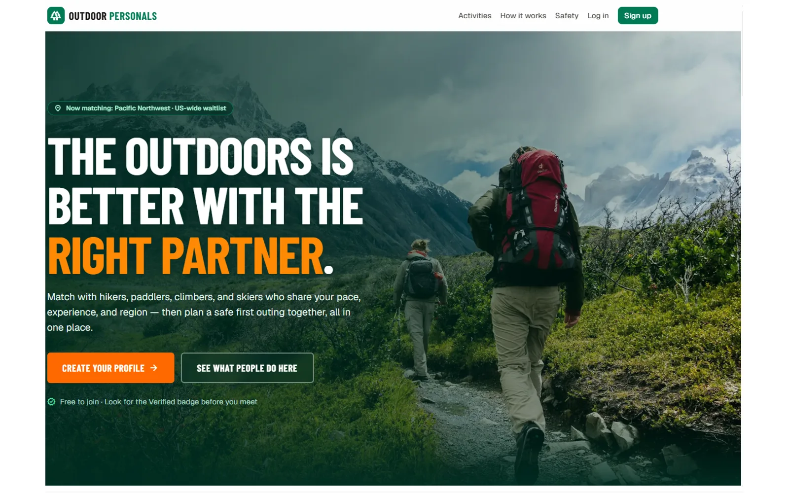
More designed & built work
-
USA Archery (proposal & working demo)
USA Archery Platform Modernization
A working modernization of a national governing body's WordPress site — 2,900+ articles migrated to Payload CMS, a rebuilt information architecture, role-based editorial workflow, and a governed AI assistant with citation-backed answers.
-
TerraGreetings
TerraGreetings
A subscription platform for printable outdoor-themed greeting cards — built end to end with auth, payments, an admin CMS, and a browser-side duplex PDF print engine.
-
KnowledgePeak.ai
KnowledgePeak.ai
An AI documentation generator that puts enterprise knowledge practice within reach of small teams — guided questionnaires produce structured articles, with provider-agnostic LLM routing and admin-configurable templates.
Questions about this work?
Happy to go deeper on any of it — the decisions, the trade-offs, or what I'd do differently.